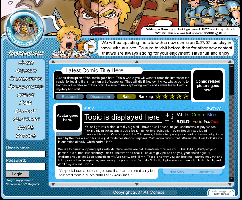
So, here's what I need from you guys. I need banners for your comics in our links section. Now, I was just going to use the ones we have here at MM, but if you wanted other ones to be used, then let me know. Also, I need opinions on our site layout. Below is a screen-shot of how it's going to look. The only thing I need to comment on is the top banner, the one from the UT comic. That picture is just a filler, that header will be replaced with transparent pictures of the characters in various dress. Like, badass new game coming out? Characters dressed up like that. Just a quick picture that we can change whenever. So, I know that banner looks awkward, it's just filler for now.
So, what do you think?
Taaa-Daaa!
Cheers!
-Wing
2 comments:
Well it feels a LITTLE cluttered. To be honest, if I were to make a site, I'd definitely make the COMIC the star. Meaning I'd but the latest page up on the FRONT page, so people dont have to navigate to it (however obvious the button is, it's still an extra button). Also, some font size variation between the menu on the left and the headers for the different windows would be nice.
The color scheme is great, the banner space is great, and the rant space is great.
Also, do you need that many buttons? You could probably get away with 'home, archive, links, cast, extra'. You could get rid of the 'advertise' link by just using project wonderful (and using the automatic link). No one would read the FAQ. Biographies of who? Also, get rid of the 'contact us' button by having your name/avatar (whoever most recently used the rantspace -- currently says 'Joey') link to your email address. Also, I see no reason to have to login to this site. From what i've observed on other comic sites, no one ever rates or comments on the pages -- that seems to be pretty unique to DD and is absent from most individual sites.
Simple is always good. Get too complicated and it starts to get cluttered with redundancies. It's a good start, keep screwin with it methinks.
I'm with acadia.
Oh man, I've been saying that a lot.
But I agree with him about everything he said. The page is really well put-together, though (like, there's no spacing or anything where there shouldn't be).
And yeah, I can't really understand the log in thing, unless maybe it links to the forum? That could work if you've got a lot of readers who want to chat it up.
And yeah, you can just use my MM banner if you wanna. I'm coo' wit dat. Lean wit' it.
Post a Comment